Saturday 11 February 2012

Evaluation: The Main Product and Ancillary Tasks

How effective is the combination of the main product and ancillary tasks?

Together, the main product and ancillary tasks convey to our target audience that 'Mill Lane' is a brand new soap opera and that the main story line is of the Essex character, Rachel Mannings, causing a disturbance in the country setting. By using the convergence of a trailer, poster and magazine cover, we have the ability to reach a wide audience and, as a result, the whole of our target market (demographic groups B to E). As the magazine and poster are paper based, this helps us to reach the consumer through a different way, as opposed to trailer which can be viewed on television or online via Youtube or Facebook.


Both the poster and trailer display the time, days and channel that the soap can be watched but this information is not included on the magazine cover. This is because, as a group, we felt that it ruined the aesthetics of the magazine cover and that this information would be displayed in full inside the magazine. It does, however, clearly state that it's a brand new soap which the trailer and poster does not. To make this more clear and effective, we should have used 'brand new' in the end voice over of the trailer, as well as including it on the poster. We did not use it on the poster as it would have needed more text, and therefore would not have conformed as well with the conventions of a poster. The use of the same images of the characters across the three products also makes them easily recognisable for our soap opera, imrpoving the effectivenss of the combination of the tasks.

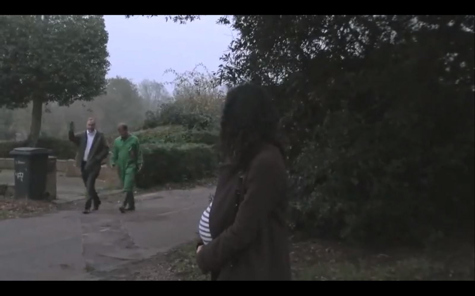
The narrative and and various story lines between each of the characters are clear in each of the products. For example, the two love triangles between Rachel, Ryan and Harriet and Charlie, Barry and Jennifer are demonstrated clearly in the magazine cover through the positioning positioning of images and the the cover lines. This is also furthered in the poster, where Charlie, Barry and Jennifer are positioned together on the right of the poster. In the trailer, the relationships between each of the characters are signified through the shot-reverse-shot between Ryan and Harriet and Rachel in her car (images below), as well as the long-shot of the interactions between Jennifer, Barry and Charlie. In hindsight, we could have made the relationships between Rachel, Ryan and Harriet more evident on the poster but we used Rachel as the focal point in the centre and she is the disturbance of Mill Lane. Though we could have changed the positioning of the characters, we felt that the layout was more effective this way.


Shot
Reverse


Shot
Long Shot

Regarding mise-en-scene, the costumes of the characters in our poster and magazines are the same so that they're easily recognisable by the audience and so that the encoded information is more likely to be deciphered by the audience. For example, Edith is seen wearing a black and white stripy top in order to connote her criminality which is also suggested through her image on the magazine, holding a knife with the tagline "Edith's death threat to Rachel". The character of Rachel also stands out against the dull colours of the other characters in the poster by wearing white, to connote innocence, and green to connote wealth and the envious side to her character. The occupation of some characters is also connoted with Charlie Collins wearing green overalls, who is a farmer. These occupational costumes also appear in the trailer itself. The encoded props are also used to help the audience to decipher the story lines, such as the knife on the magazine connoting death and violence, and Harriet's red car connoting love, relationships and anger. The shovel carried by Charlie in the trailer also connotes his occupation and social status. However, not all the props and costumes are consistent in all three products. If they had been included in all three tasks, the encoded information about the characters may have been received easier in a dominant reading.


The concept and tagline of "Out with old, in with the Essex" is demonstrated through the tagline of the poster but it's not totally clear on the magazine cover, which shows a variety of story lines, or the trailer. Though it's obvious Rachel's character is causing a disturbance during the trailer, it can be argued that this message is not clear in the other products unless the poster has been seen. Together with three products, however, the message is portrayed effectively to our audience.

The colour schemes throughout our poster and magazine are not consistent but conform to the conventions of each product. For our magazine, we used a bright colour scheme of red, yellow, black and white connoting themes of relationships, love, happiness and death or which appear in out trailer. This was also necessary to follow the generic conventions of soap opera magazine covers as discovered in our research. Our poster used a sepia tone colour scheme, contrasting that of the magazine. Though it makes it more difficult for the products to appear to interlink, it was necessary with our concept and tagline "Out with the old, in with the Essex" - the browns connoting the outdated, countryside setting and the normal coloured Rachel Mannings connoting the new, exciting character and soap opera. To improve the colour schemes of our product, we could have used a more varied colour scheme. Though the combination is still effective, an improvement in colour scheme could have improved our promotional products.

Another inconsistent feature of our main and ancillary tasks was the use of logos. In our soap opera trailer, the final credits displayed the logo of our soap opera which is not used on either the poster or magazine. This was due to the aesthetics of our poster and magazine, as we felt it would be more attractive for our audience. Including the same logo on all three products may have made it easier for the audience to relate the products and recognise "Mill Lane" as the name of our soap.

Though separately our messages and story lines can be a little difficult to decipher, together the combination of the main product and ancillary tasks convey our encoded messages to our audience clearly and effectively. Also, it can be argued that if our story lines were obvious, there would not be much for the audience to find out and the ambiguity could actually attract more viewers to our soap as they wish to find out what is happening in Mill Lane.

Evaluation: Audience Feedback

What have you learned from your audience feedback?

Tuesday 7 February 2012

Evaluation: Technologies

How did you use new technologies in the construction and research, planning and evaluation stages?


Here are some of the uses of the different technologies I used throughout our research, planning, production and evaluation stages explained in more detail:
Technologies

Monday 6 February 2012

Evaluation: Use of Conventions

In what whats does your media product use, develop or challenge forms and conventions of real media products?


The Trailer

Conventional Narrative: An open and fractured narrative it used, sometimes with forking paths to show different perspectives of a situation or event. In Todorov's Theory, a disturbance is always recognised but there is not always equilibrium before this. Usually, only a victim or villain is recognised from Propp's Theory in a soap opera trailer. 

In our trailer, we used an open narrative with forking paths around the main event (Rachel's arrival). The disturbance of Rachel arriving is signified by the change of the non-diegetic soundtrack and juxtaposition, the second non-diegetic soundtrack and the establishing shot and nature, as well as the reactions of several characters. However, we challenged convention narratives by allowing a change in time throughout our trailer, transitioning from day to night. This reflects not only the change in time, but also connotes the effect of the new character, Rachel. As her disturbance begins to appear, it gradually gets darker until she arrives at the local pub building suspense until her reveal. A similar existing product is this trailer for Emmerdale, where the main character causing a disturbance is recognised and reacted to by the other characters in the trailer. This not only mirrors our narrative but some of our shots also appear, such as the girl looking out of the car at 0:20. However, it is night time throughout the whole trailer setting a dark atmosphere from the outset instead of gradually building, as seen in our trailer. 


Conventional Camera Angles: Camera angles vary between close ups, mid-shots and two-shots. Over-the shoulder shots are also used during diegetic conversations. High and low angles are not necessarily used in order to keep the audience feeling engaged in the scenes but may be used significantly to signify inferiority and superiority of certain characters. 
Throughout our trailer, we followed the generic conventions of camera angles using mainly mid-shots and long shots, with a close up of Rachel's feet. However, we also challenged them by including a tilt and a low angle for the reveal of Rachel's character at the end in order to build suspense, connote a strong-minded and dominant character as well as to encourage the audience to ask questions about our soap opera. We also did not use an over-the-shoulder shot as planned due to problems whilst filming and positioning the camera. Had we done this, our trailer may have been more conventional. Below are four examples where we have both followed and challenged soap opera conventions.
Evaluation 

1. Though the location is the same, we challenged the normal conventions by adapting the angle of the camera (left image) into a close up of Rachel's feet in order to keep the identity of her character hidden until the end of the trailer, building suspense for the audience. Also, Rachel is the one causing the disturbance in Mill Lane whereas the characters in the Emmerdale trailer are reacting, denoted through the mid-shot displaying their emotions and body language. However, the framing of both shots includes the door to the pub, as well as the front step and plants. Here, we have challenged a convention.


2. This shot from our trailer (left) also mirrors that in the Emmerdale trailer as both characters are in a car, looking at another character. Mid-shots have both been used as the character looks out of the window, denoting their body language and emotions, but we have used a different angle in order to fit the continuity of our trailer. Here, we have followed a convention.


3. Both of these shots have been used to reveal the identity of a female character, building suspense for the audience and encouraging them to watch the full episode. They are also both close ups, starting on the feet before vertically panning up to the face. We have challenged this convention, however, by using a tilt instead of a vertical pan, creating more of a lower angle. This denotes the dominance of Rachel's character more clearly than that of the EastEnders trailer, but both appears to be menacing and authoritative. 


4. This final shot we have challenged by changing the mid-shot (left) from the Neighbours trailer to a long shot in our own trailer. Not only did this allow us to denote the scene clearer, but also to clearly allow Rachel's character to disturb the scene between the mechanic, Ryan, and Harriet.

Links to trailers:
1. http://www.youtube.com/watch?v=SGXX2ubwoIU
2. http://www.youtube.com/watch?v=SGXX2ubwoIU
3. http://www.youtube.com/watch?v=8p4xlLezos0
4. http://www.youtube.com/watch?v=tB8aRKT5NK0

Conventional Titles: The channel is sometimes displayed at the bottom of the frame throughout the trailer but the final titles include the channel, time and day that the soap opera is broadcasted. If titles appear during the trailer, there are few. The text is also in a simple font and neutral colour.

As an important convention of soap operas in communicating the soap opera's details, we clearly displayed our channel, time and day at the end of the trailer in order to inform the audience. We used a simple, black and white theme font in order to follow the conventions as this also looks the most professional.


Conventional Mise-en-Scene: 
used by characters are minimal and used to set the atmosphere or highlight the disturbance. A non-diegetic soundtrack is used throughout the trailer and a non-diegetic voice-over summaries at the end of the trailer. If the soap opera has a jingle, this will also be used as a sound bridge at the end of the trailer. Lighting is lower in the shots where the disturbance is recognised and higher where it is not, except for when juxtaposition is used. 

In our soap opera, we challenged conventions by using predominantly exterior locations of homes, fields, and a street, except for interior shot of Rachel in pub whereas they would normally include predominantly interior locations. Also, instead of using props to set an atmosphere, we simply used them as signifiers to denote the occupations of the characters - a car for Ryan, the mechanic, and a shovel for the farmer, Charlie Collins. The lighting also decreases throughout the trailer as the day continues which is unconventional for soap opera trailers since they are generally set at one moment in time. 

Conventional Editing Style: Shot durations are short, generally lasting between 1 and 5 seconds maximum so not much is given away. Transitions of razor cuts, dissolves and fade-to-blacks are used throughout following the typical trailer style.

As an important convention in order to keep audience engaged, we ensured that the shots lasted no longer than 5 seconds in order to keep the pace of the trailer and follow the generic editing style of soap opera trailers. We also used fade-to-blacks between each scene and razor cuts throughout. An existing trailer with a similar editing pace to ours is this trailer for EastEnders.


Conventional Sound: A non-diegetic soundtrack is used throughout the trailer with a non-diegetic voice over at the end of the trailer stating the name of the soap, time and channel it can be viewed.  Diegetic conversation is often used to encode and communicate to the audience the story lines of the trailer, rather than a non-diegetic voice over. 


Throughout our soap opera trailer, we used a non-diegetic soundtrack but we challenged the use of it through the use of two in order to connote the equilibrium and disturbance in our trailer (Todorov's theory of narrative). It began slow paced with a low pitch in order to connote the peaceful and relaxed setting of Mill Lane. The use of foley effect of the radio being tuned when Rachel's character hits it, along with the transition into a new non-diegetic soundtrack with a higher tempo and pitch helped to connote a new character, Rachel from the city, entering an old area. It was also in the genre or style of dance, which is also unconventional as it juxtaposes with the more serious story lines and themes, as well as the calm countryside setting. However, as a group we felt it was more effective in reaching a younger target audience and also denoting that a lively character of Rachel Mannings was interrupting the peaceful countryside.  

The Magazine Cover


Conventions: Use of a large, main image to go with the main cover line (1/4 of the cover) and lots of smaller images and cover lines of different characters. It will also include selling points such as a cheap price and extra features, like discounts, so that audience feels like they are getting more for their money. The colour scheme is bright to connote the themes of our soap opera (e.g. pink to highlight text and connote love and yellow to connote happiness or alarm). Text is of a bold, bubbly font to grab the audience's attention and no gaps or space is left. The left 1/3 of the page is used to include important information and key selling points and the magazine name is catchy, short and relevant to soap operas.


We kept our magazine cover conventional by using a bright colour scheme of red, yellow, black and white in order to catch the eye of a potential consumer, as well as connoting excitement, anger, danger and themes of relationships and romance. We also have used a key selling point of "2 weeks revealed" but have kept the price unconventionally high in order to reach an older target market, connoting a good quality magazine. The barcode, magazine title and main cover like has been used in the left 1/3 of the cover, as well as the main image and cover line taking up 1/4 of the space on the cover. The magazine name is also short and catchy and the font is bold.


The Poster


Conventions: A use of bright colours to grab the audience's attention as well as large images and minimal text to inform the audience quickly. Also, there is a use of colours that connote the target audience and themes (e.g. pinks for relationships and blue for youth). The channel, the time and day the soap opera is broadcasted is displayed clearly, as well as a tagline to inform the audience quickly and keep the poster to the point. An iconic logo for the channel/broadcasting company should be used to reduce text. 


Our poster is also conventional as it uses minimal text, except for the tagline and incorporates a logo for the channel name. The time, channel and days the soap is broadcasted is also clearly displayed and the poster is predominantly images. The colour scheme isn't bright with the background characters in sepia to connote that they are old and traditional, where as Rachel is new and exciting. This is unconventional but necessary in order to convey our message and emphasise the tagline.  

Conventional Characters: According to Propp's Theory of Characters, a successful story or narrative will include the seven characters of the hero, villain, princess, false hero, donor, dispatcher and the helper. Since we only encode the state of equilibrium, disturbance and recognition of the disturbance in our trailer, poster and magazine, not all of the characters will be established. As a trailer, it is necessary to keep some information hidden for the full episodes. Therefore, encoded information about these characters must be used in order to keep the audience intrigued.  From the combination of our soap opera trailer, magazine and poster, these characters have been encoded according to Propp's theory:

- Villain: Rachel Mannings
- Princess: Harriet Collins
- Hero: Ryan Parker, Charlie Collins
- False Hero: Edith Jones, Jennifer Ward, Barry Brooker
- Donor: Unknown
- Dispatcher: Unknown
- Helper: Unknown

Some of the characters have remained anonymous in their role of the narrative until the recognition of the disturbance in Todorov's theory of narrative. This holds the audience in suspense and encourages them to ask questions and try to decipher the encoded information, therefore to watch the soap opera to see if they were right. These were recognised through the camera angles used in the trailer and their interactions with other characters, as well as their positioning on the poster and their costume or any props. As only a promotion for a new soap opera, we did not push the boundaries or break conventions regarding the characters and Todorov's theory of narrative in order to conform with the generic conventions of trailers.

Wednesday 1 February 2012

Final Products

These are the final products with the improvements based on our audience feedback.


Final Poster 2