Monday, 31 October 2011

Soap Opera Logo Designs

After researching into existing logos for soap operas, I have created 3 designs, the best one I will take to my group as input for creating our final logo design. 


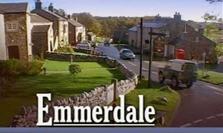
This first design was inspired by both the Emmerdale and EastEnders logos as they both use a background image to support their soap opera name. Since our soap opera is set in a rural location, I found an image of a field to connote this to our audience, helping them recognise our soap. The text itself I have chosen to resemble that of a street sign, but reversed the colours in order for the name to stand out more. This, combined with the capital letters and bold font, creates a striking effect for the audience and juxtaposes the calm background image - similarly to how our story lines contrast the settings in our soap opera. 


My second design also resembles that of a street sign, but I have incorporated green into the design to connote the rural setting of our soap opera. Though this logo does not have a background image to help it stand out, it can easily be applied to any shot in a trailer at any size since it's simple and has bold, white text. I also chose the colour green as it was not used in any of the existing logos I had researched, making it unique and, possibly, iconic. 


The final design that I've created is a lot plainer than my previous designs but can also easily be adjusted to fit any shot. By altering the outline of the logo to a chalky effect and using an old fashioned font, this logo connotes a typical, old-fashioned setting. However, it could also allude to an old-fashioned soap and this is not what we are looking for. In order to reach our varied target audience, we need a logo that appeals to various age groups and I believe that a more colourful logo would help us reach our target audience. 

The design I have chosen to take to my group is number two, as it is the most unique and connotes the rural setting of our soap opera. It's also looks professional and can easily be cropped into various frames in our piece.

Research into Soap Opera Logos

For the final titles in our trailer, our group decided that we should have an iconic logo for our soap opera so that the audience could immediately recognise it. Predominately, logos will appear at the end of the opening titles and end of the final credits in episodes, but only at then end of trailers and so this is where ours will be placed. To make sure the audience remembers our soap opera, we need to create an eye-catching logo. In order to create the best design for our logo, I have looked at existing logos and evaluated them in a comparison table so that I can create my own, unique designs and feed them back to the group.


When creating my own designs for our soap opera, 'Mill Lane', I will use the logos of Coronation Street and Hollyoaks in particular as inspiration, since Coronation Street has a wide target audience but incorporates the sign as their logo, as well as Hollyoaks which uses colour to attract younger audiences.  

Research into Channel Logos

As with our soap opera logos, we also need to create our own channel logo. Since we agreed that our channel will be called 'DECS', I need to create a short but professional logo so that the audience can easily recognise our production company. By looking at various other existing channels, I will be able to see what ours should consist of and what I need to create a unique and creative logo. 


After evaluating these logos, I will use the logo for ITV and MTV as my main inspiration. This is because ITV broadcasts Emmerdale, a similar soap opera in terms of settings and target audience, and because MTV is more modern, aimed at teenagers or young adults which is close to our target audience. It is important that our channel logo connotes to the audience that our channel caters for a range of audiences and I think a combination of these two logos will help me produce the best ideas.

Channel Logo Designs

These are the three designs I have created our channel, one of which I will take to the rest of our group in order to help create our final channel design. 


This is my first design for our production company. Unintentionally, this logo does resemble that of the BBC but the green around the letter D adds a unique twist. Since our group was formerly 'Green Productions', I have incorporated this colour to keep with our theme. The green also connotes wealth and can suggest to the audience that we are a professional, wealthy and well-known channel creating verisimilitude for the audience and to make our production more believable. The background of this logo, however, could be problematic when trying to place it various frames - our last shot with the titles will be black and we would need a white background on the logo. This could make it look less professional for our trailer.


My second design also incorporates the green from our previous group and the previous design to connote wealth, but the font I have used for 'DECS' also makes it look like the logo is for a record company, rather than a production company. It's for this reason I will not use this logo as we do not wish to confuse our audience. Though the diamond creates a background for the channel name to stand out, as with the background in my first design, it would be difficult to add the logo to random frames since it would need a white background taking away the professional quality seen with other channel logos.


This is my final design for our channel logo. This time, I have removed the green and used a greyscale colour scheme so that the logo can easily be applied to any frame in our trailer. The bubble writing within the smaller rectangle connotes youth and creativity, showing that our channel broadcasts shows for all the family - including our soap opera. This is also demonstrated with the outline of the logo as it fades similarly to a pencil line connoting our channel's ability to adapt to the market and produce new, creative shows. Unfortunately, this may be more appealing to a younger target audience and not to the older generations which could prevent some viewers watching our channel. However, this is similar to our aim for our soap opera - we wanted to modernise what is considered to be an old-fashioned, rural soap opera.

I have chosen my final design to be presented to the group as it connotes our young approach to soap operas and also has an easy colour scheme which can be applied to any frame.

Soap Opera Magazine Name Ideas

As a group we were struggling to create a name for our soap opera magazine and so I created this mind map with some stimulus and research in order to try and find a suitable name. To expand my ideas, I also used a thesaurus to find words of the same or a similar meaning. The names highlighted are my favourites which I will forward to the group as suggestions.

[scan]

SoapSecrets: Short with few syllables, uses alliteration creating a 'hushed' sound when read (onomatopoeia), catchy, connotations of secrets and hidden information - easy to remember.
SoapBuzz: Short with only two monosyllabic words, catchy, connotations of excitement, also memorable.
SoapMonthly: Short with few syllables, denotes frequentation of release (too long), memorable.
SoapSponger: Short with few syllables, connotations of lots of information, humourous, alliteration makes it catchy and memorable.
SoapConfessions: Not necessarily short, connotations of secrets and gossip, memorable but with 4 syllables.
BritishSoaps: Short, unique idea due to inverted use of 'Soap', denotes British television, not very exciting, memorable.

Friday, 7 October 2011

Soap Opera Name Ideas

One of the final things to think about was a name for our soap opera. I brainstromed soap opera names that already exist and the reasaons behind it, including what they connote and which area they represent. This is my mind map showing different ideas for our own soap opera:


From this brainstorm I have decided on 'Broomfield Mill', 'Mill Lane' and 'Mill County', since the road name we have chosen to film is 'Mill Lane', as potential names and will suggest these ideas to my group.