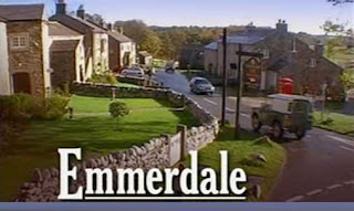
When creating my own designs for our soap opera, 'Mill Lane', I will use the logos of Coronation Street and Hollyoaks in particular as inspiration, since Coronation Street has a wide target audience but incorporates the sign as their logo, as well as Hollyoaks which uses colour to attract younger audiences.
Monday, 31 October 2011
Research into Soap Opera Logos
For the final titles in our trailer, our group decided that we should have an iconic logo for our soap opera so that the audience could immediately recognise it. Predominately, logos will appear at the end of the opening titles and end of the final credits in episodes, but only at then end of trailers and so this is where ours will be placed. To make sure the audience remembers our soap opera, we need to create an eye-catching logo. In order to create the best design for our logo, I have looked at existing logos and evaluated them in a comparison table so that I can create my own, unique designs and feed them back to the group.


